
Happy Friday! Over the past two weeks, I have enjoyed showing you the official Martin Family Home Tour! And over the past year, I’ve loved showing you all the design progress over on Instagram. As our house has become a home in those months, I have gotten plenty of questions on decorating with color and pattern and bold choices, so I figured it would be fun to wrap up the tour by giving you a few of my go-to home decor tips!
Whether you are starting from scratch or simply want to update your home with a few new touches, here are 10 tips to help you get a designer look you can actually live in and enjoy with your whole family!
10 Tips for Decorating with Color and Pattern
tip #1: pick a foundational home color
If you are ready to start incorporating color into your world, the first thing I’d suggest you start with is a foundational color for your entire home. The foundational color will act as the visual constant from room to room and help create a “flow” in your home design. The foundational color should make its way from room to room in one way or another to create a visually cohesive framework for you to build on.
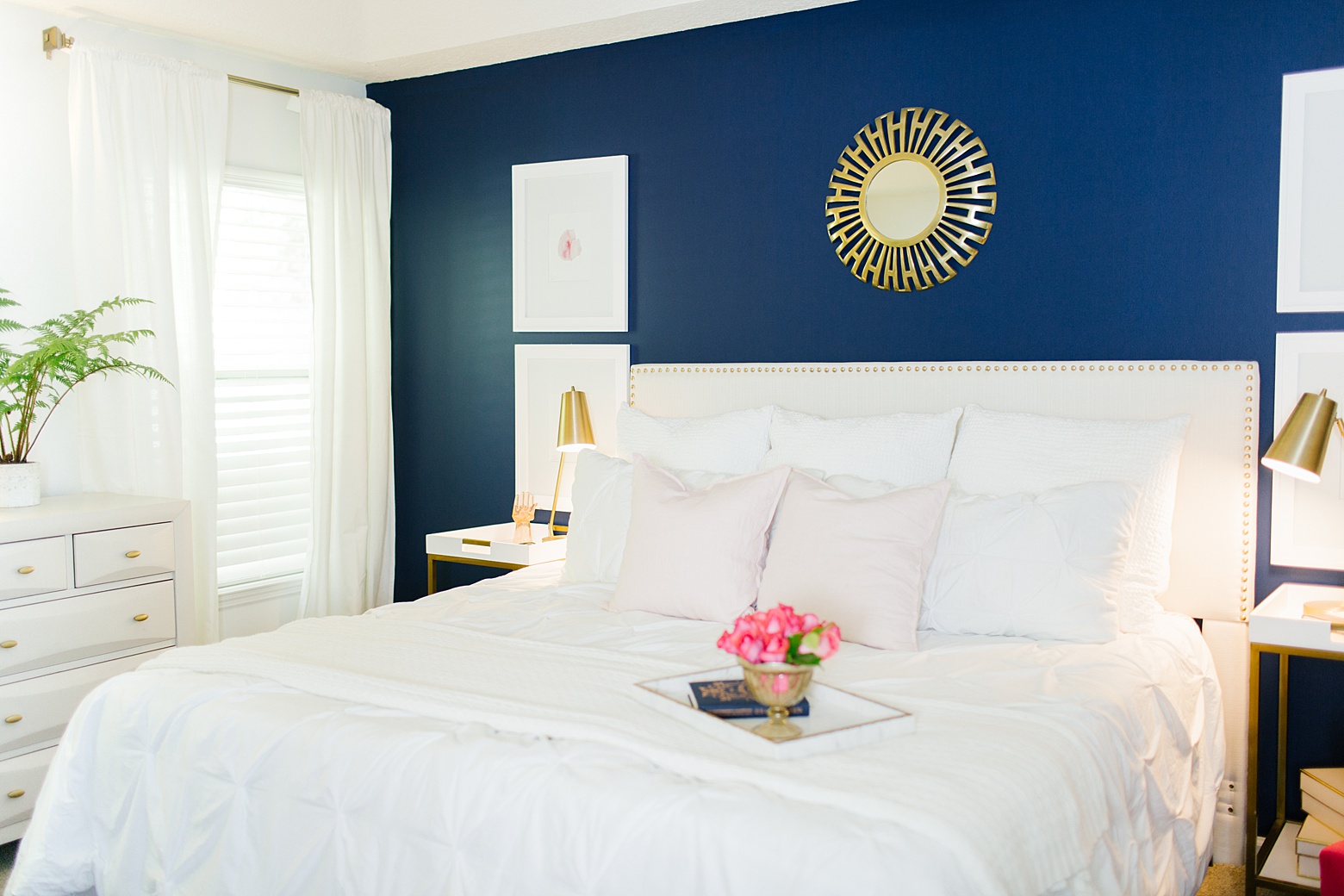
Navy is our foundational home color!
tip #2: don’t limit your home decor to 2 colors
This is a little (big) design tip I learned in my wedding planning days. When it comes to picking color palettes and schemes, the majority of people think in twos or threes.
Green and White. Navy and Pink. Mint and Blush. White and Cream. etc etc.
When you limit yourself to only two or three colors for your home (or wedding!), your design will quickly become very matchy matchy and repetitive. Take a look at designer homes on Pinterest. Don’t fixate on the actual details of what they include in their designs, but take a moment to look at the depth of the look in terms of colors, layers, and textures. The most stunning designs aren’t limited by one wood tone, one metal, one pattern or one or two colors. The more you allow yourself to layer and experiment with various shades, tones, patterns, and textures, the more your home decor will build in depth and get that designer look!
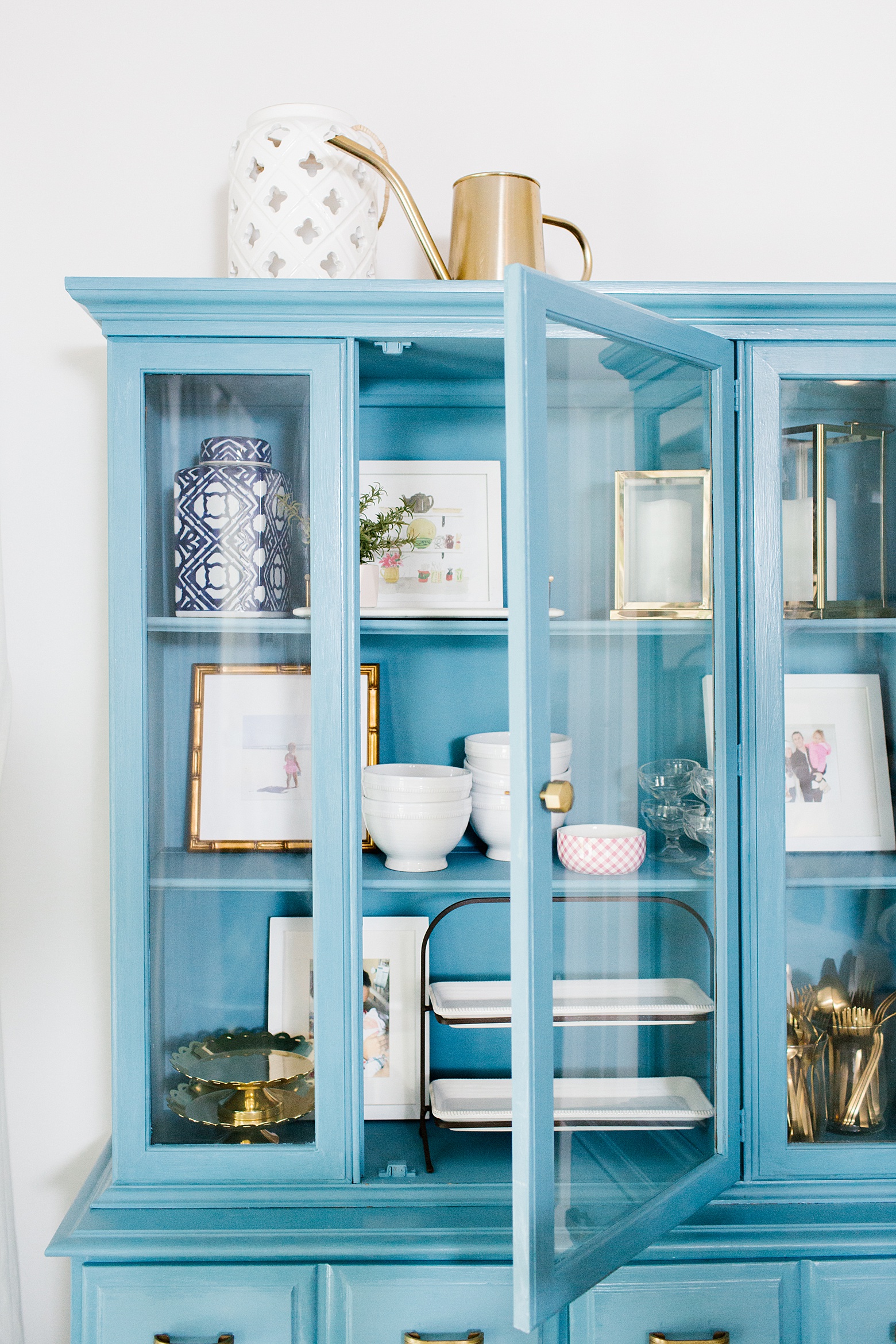
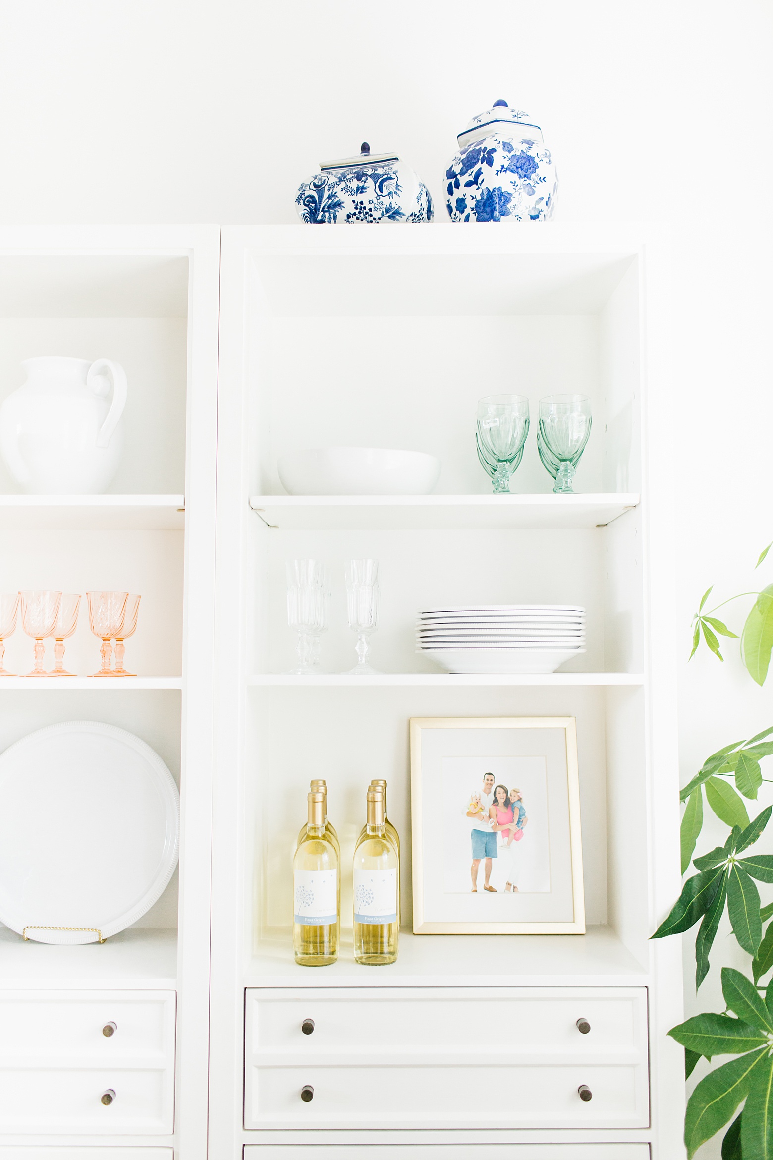
My home palette includes a whopping 10 colors in navy, medium blue, hot pink, blush, mint, gold, white, black, mustard, and emerald, textures of wicker, wood, mercury glass, and, greenery, and patterns like stripes, leopard, florals, chinoiserie, gingham, quatrefoil, and preppy graphic prints. Oh my!
tip #3: don’t head to the factory first
Retail and factory home decor and furniture stores seem like the obvious choice to stop in at when you’re decorating your home. But I’d challenge you to stay away from the big boxes at first.
Why?
Well, here’s the thing: You aren’t the masses. You are unique. And from the largest pieces of furniture to the smallest of details, you can create a truly unique design for you and your family. As beautiful as they look, your house isn’t meant to be a Pottery Barn or West Elm catalog.
The key to mastering texture and layers within your home lies in blending the old with the new. Before you buy that entire matching set from World Market, do a quick search for local vintage shops. There are so many treasures in vintage shops that can help you create a completely unique look in your home.
I find my treasures first and then I go to the retail stores to fill in the gaps for specific needs.
tip #4: when in doubt, use the rule of threes
A friend once jokingly told me that she doesn’t understand how I can make a colorful home look good. She said she tried to incorporate multiple colors in her home and it ended up just looking like a blown up rainbow! ,
If you’re ready to explore color, there’s a handy little rule that can help you get a cohesive look without your home turning into Trolls 2: The Rule of Threes.
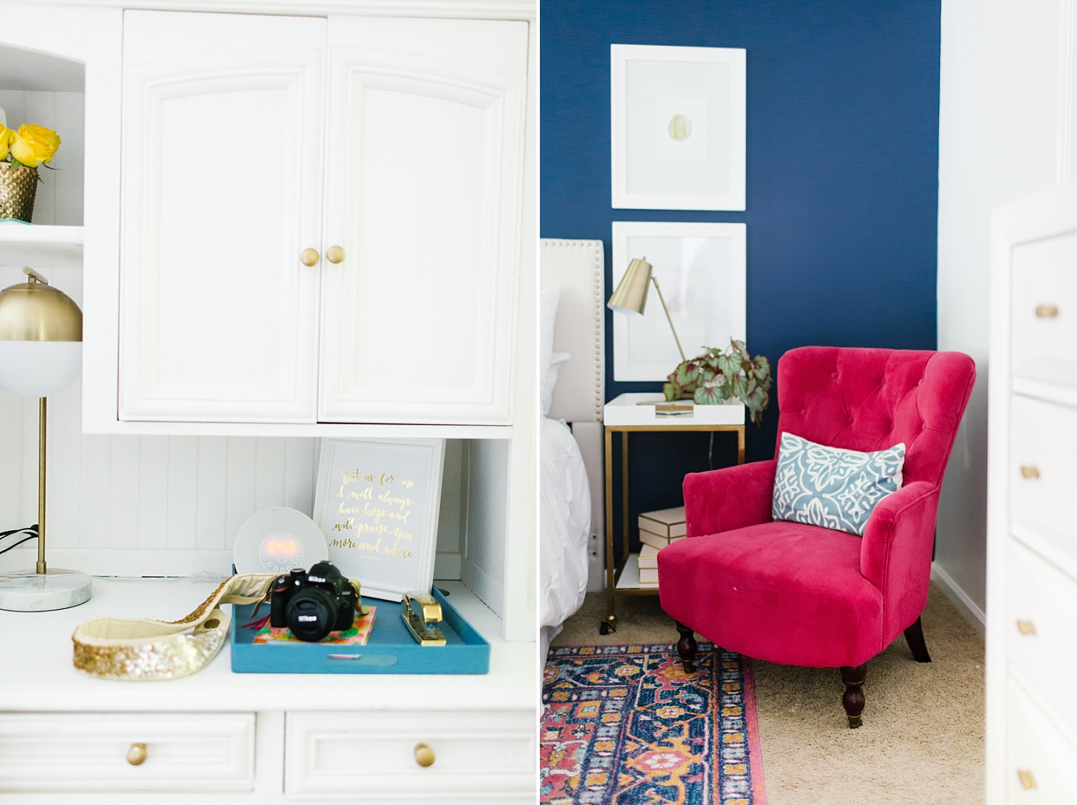
The rule of threes says to repeat every color in your design at least three times. In the scope of your home, think of each room as its own design. So if you are following the rule of threes, you would repeat any given color three times within one room. For example, my master bedroom has a color palette of navy (my home’s foundational color), pink, mustard, medium blue and gold. Medium blue pops up three times in a painted tray on my desk, in the pattern of our rug, and in an accent pillow on our chair.
The rule of threes helps keep you from compiling a hodge-podge of random colors (aka a blown up rainbow house!), and instead builds a beautiful blend of colors to create your own unique palette!
*Tip: If you are working with a wide open living space, you can use the Rule of Threes for the entire flow of the space. For example, a color could appear in your living room and in your kitchen for your count!
tip #5: but don’t be afraid to break the rules
I have a secret: being a rule breaker is fun. 😉
The Rule of Threes is a handy tool, but don’t feel like you have to stick to that in all cases. It is a great place to start, but don’t drive yourself crazy or empty your bank account to ensure that every color is repeated three times in a given space. Some colors and textures can be treated like neutrals or visual pops and don’t need to adhere to the rule.
In my home, I have small touches of brown here and there, but I don’t consider brown apart of my color palette. In the example of my master bedroom, I have a wood tripod lamp on our dresser. Brown isn’t repeated anywhere else in the room and that is okay.
Remember, the goal isn’t to have a matchy matchy house. Unexpected pops of color, texture, or pattern are a good thing and keep your design visually interesting!
tip #6: greenery is always a good idea
Your color palette doesn’t have to include green to use greenery in your home. Plants are not just trendy, they are a fantastic way to add a layer of texture to your design.
I prefer the look of real plants over fake ones, but I do have a few faux plants and flowers around our house. If you want to use fake over real, I would suggest repotting your plants. Rarely does a faux plant come in a pot that actually looks good in your design scheme. Buy for what the actual plant looks like and not what pot it comes in. You can easily update the look by popping it in a large basket or a pretty pot that matches your style.
If you do go faux, I also suggest it is one of the places you splurge. An obvious fake plant can quickly turn into an eyesore. Look for ones that are truly realistic for an effortless look. Pottery Barn is my first choice for faux plants and blooms!
tip #7: whitespace is your best friend
Friend, just because you have a wall does NOT mean you have to put something on it. Whitespace is just as much a part of design as details you see.
This is where some of the biggest home decor mistakes are made. Mostly due to trying to fill every wall on a budget.
It is a far better idea to spend a little more on a stunning accessory or piece of art to create one beautiful focal point than to try to put something on every single wall. Before you go to fill that empty spot, nook, or cranny, look around the room. Are there spaces in your design for your eyes to rest? If not, let it be and meet your new best friend, whitespace. 🙂
tip #8: the literal color white, too.
When working with bold colors and patterns, incorporating the color white is a good idea. Naturally, it creates whitespace.
I love the look of white walls. They feel fresh and pretty and create the perfect canvas for you to build a colorful design with. White walls don’t compete with your home decor details so the sky is truly the limit! With a blank canvas of crisp white walls, you have the flexibility for your home design to evolve as you go.
That way in 3 years when you just can’t look at the color yellow anymore, you can just swap out the decorative details in your house instead of repainting every wall!
tip #9: when it comes to patterns, size matters
The key to mixing patterns lies in mixing sizes of patterns.
Remember matchy matchy is a no-no. And that applies to the scale of your patterns, too.
You want to avoid having too many patterns of the same size. To explain, take a look at my living room:
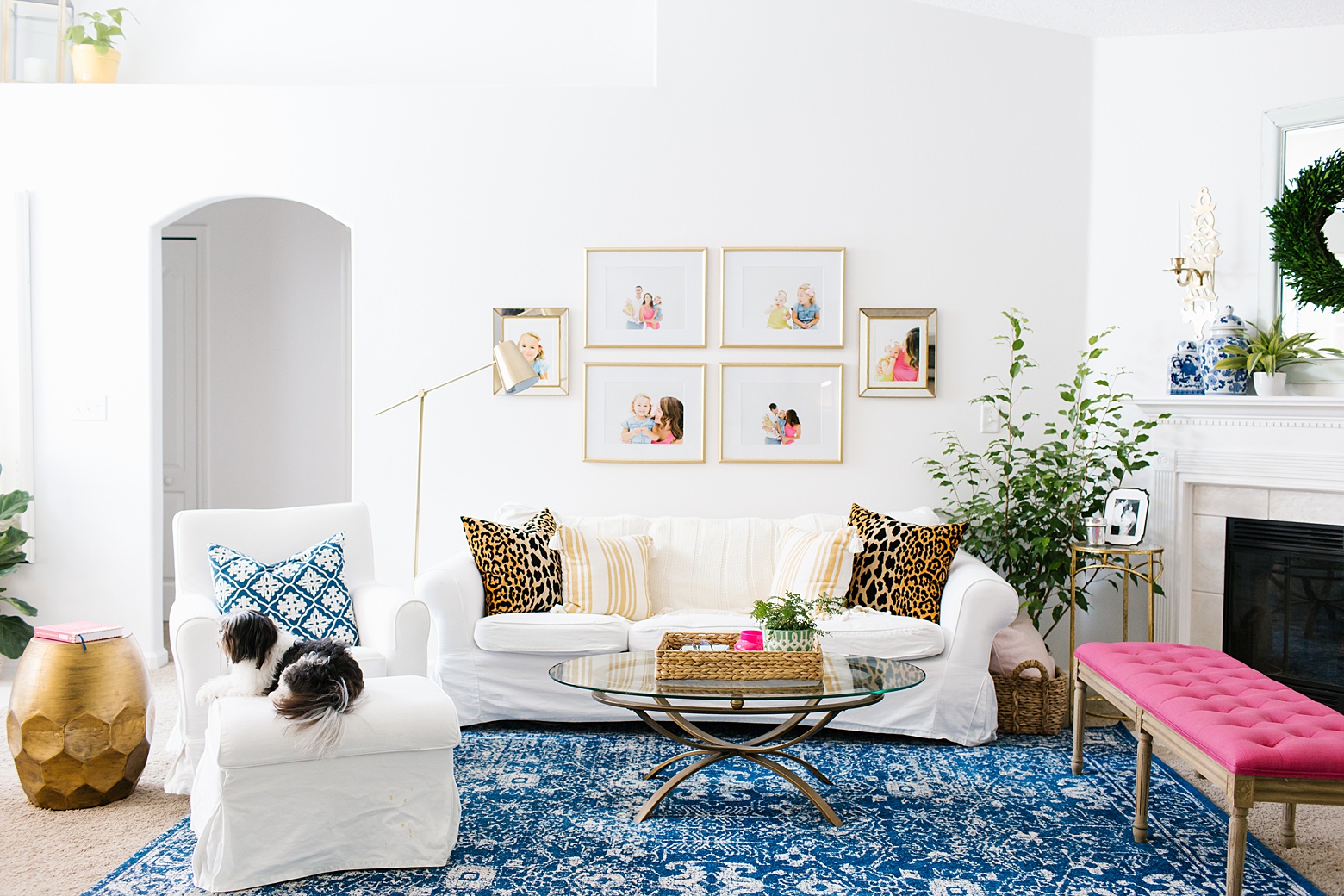
Our navy and white rug is a large scale pattern. The navy and white pillow is a step down in terms of pattern size. The leopard pillow pattern is another step down followed by the mustard stripe pattern and finally, the green and white pot on the coffee table and ginger jars on the mantel are the smallest patterns.
While you might not be ready to mix quite as many colors and patterns as I do, I want you to think about the scale of your patterns when you start mixing.
The Rule of Threes can come in handy here as well. When you go to mix patterns, aim for choosing at least three different patterns in three different pattern scales (a large, a medium, and a small). It works for both a more monochromatic look with your patterns in a similar shade of one color and a more colorful approach!
tip #10: conventional is overrated
I saved my favorite tip for last. 😉
The older I get and the more my aesthetic evolves, I am learning that good design isn’t about checking things off a proverbial list of things you should do or have to complete a home. The best design tip I can give you is to create a unique space for you and your family that fits just right. Nothing is better than that!
If you want a house with 10 colors or have a random mismatched pattered figurine to display from the best 7 days of your life in Maui, you do you. The most beautiful homes are filled with special details that matter!
Have another great tip for decorating with color and pattern in the home? Tell me about it in the comments!
Photography by Sarahdipity Photos

share this post on:
comments
0
leave a comment